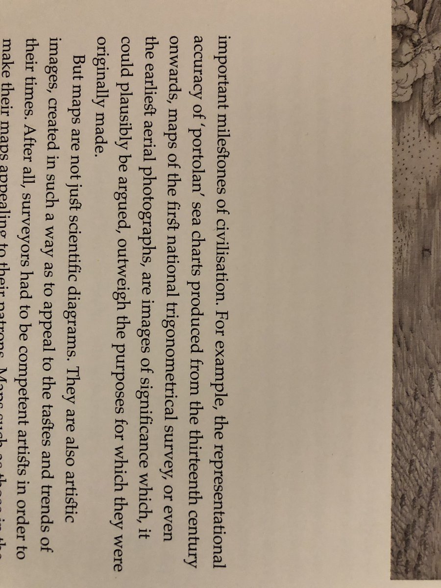
Font geeks plz explain whatwhy someone would use this typeface / setting that bridges the ‘s’ and ‘t’ with a damnable flourish THAT IS LITERALLY DRIVING ME OUT OF MY MIND EVERY TIME I SEE IT – thereby ruining the otherwise sublime “Atlas: A World of Maps From the British Library”
by
joe lamantia
–
Recent Posts
- Long-Term Outcomes: Customer-Centered Product Strategy For Machine Intelligence – Part 4
- Jaunt: “a social platform for sharing and discovering documents & presentations”
- Foundations: Customer-Centered Product Strategy For Machine Intelligence – Part 3
- Voice Over and Video – Flying Blind On a Rocket Cycle: Customer-Centered Product Strategy
- ‘The Present Future: AI’s Impact Long Before Superintelligence’
- Talking Product Strategy for Machine Intelligence @ ProductCamp Boston
- 16 years of @mojoe: (re)publishing a twitter archive
Tags
ai ai / ml augmented reality customer centered cyberpunk dead_media design systems enshittification enterprise enterprise architecture human agency infrastructure internet history llm machine intelligence patterns portfolio planning productcamp product development product discovery product management product strategy professional practice social utility technology and society transformation twitter ubiquitous computing user experience